20+ Home Color Ideas Outdoors to Boost Exterior Curb Appeal

Your home’s exterior looks forgettable and dated. Every time you pull into your driveway, you notice how your faded, builder-beige house blends into the neighborhood without personality or presence, making your entire property feel generic regardless of interior updates or landscaping efforts. Meanwhile, neighbors repaint in stunning color schemes that transform ordinary homes into architectural showpieces while you’re stuck with safe, boring choices from decades ago that actively hurt curb appeal and property value. The frustration builds when you realize exterior paint colors create the first and lasting impression on visitors, potential buyers, and even you judge your entire home based on outdoor presentation before ever stepping inside.
Here’s the transformation secret: strategic home color ideas outdoors deliver dramatic impact that boosts property value by 5-10%, distinguishes your home from surrounding properties, and creates cohesive visual harmony reflecting your personality while respecting architectural style. With proven color selection principles and expert palette strategies, you can confidently choose exterior colors that make your home the neighborhood standout instead of the forgettable afterthought.
Why Exterior Color Selection Matters More Than You Think
Strategic exterior paint colors deliver measurable financial returns beyond mere aesthetics. According to Zillow’s Paint Color Analysis, homes with specific color schemes sell for $1,809-$6,271 more than expected charcoal or black front doors add $6,271, while greige exteriors command premiums. Beyond immediate resale benefits, quality exterior color choices protect your home structurally through heat-reflective palettes reducing cooling costs by 15-20% in hot climates according to the Department of Energy.
Color psychology affects emotional responses creating welcoming or unwelcoming first impressions unconsciously. Warm earth tones evoke stability and tradition, cool blues and grays project modernity and sophistication, while bold accent colors signal confidence and creativity. Your home color ideas communicate messages about interior quality, maintenance standards, and owner personality before anyone steps through your door; these psychological impacts matter tremendously for curb appeal and marketability.
Understanding Color Theory Basics for Exterior Design
Color temperature divides palettes into warm and cool categories affecting visual perception dramatically. Warm colors reds, oranges, yellows, and their derivatives advance visually making homes appear closer and larger. Cool colors blues, greens, purples recede creating distance and making oversized homes feel proportionally smaller. Choose temperatures complementing your home’s architecture and size rather than fighting inherent characteristics through mismatched palettes.
Undertones determine whether neutral colors read warm or cool affecting coordination with existing elements. Beiges contain pink, yellow, or gray undertones dramatically changing appearance in different lighting. Grays lean blue, green, or purple creating vastly different moods. Test large samples on multiple walls observing them through morning, afternoon, and evening light revealing true undertones. Small paint chips lie under showroom lighting conditions nothing like your property’s actual illumination.
Complementary colors sit opposite each other on color wheels creating high-contrast drama, while analogous colors neighbor each other providing harmonious subtle transitions. Traditional home color ideas outdoors often use complementary accent colors, blue-gray siding with rust-toned doors creating focal points drawing eyes intentionally. Contemporary palettes favor analogous relationships with various grays from light to charcoal establishing sophisticated restraint over bold contrast.
How to Choose Colors Based on Architectural Style
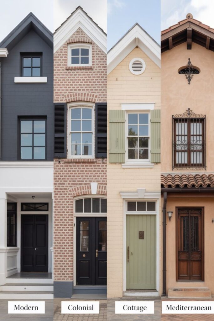
Victorian homes demand period-appropriate home color ideas honoring ornate architectural details. Classic “Painted Lady” palettes use three or more colors highlighting trim, brackets, and decorative elements base colors in soft greens, blues, or taupes, accent colors on trim and details, contrasting shutters and doors. These historically informed choices respect architecture while allowing personal expression through specific hue selections within appropriate families.
Craftsman homes suit earthy, natural palettes reflecting Arts and Crafts movement philosophy. Rich browns, deep greens, warm grays, and rust tones harmonize with signature stone or brick foundations and wood details. Keep schemes simple using 2-3 colors maximum typically body color, trim color slightly lighter or darker, and accent color on doors. Overly bright or stark white trim violates Craftsman aesthetic sensibilities favoring subtle earthbound palettes.
Modern and contemporary homes embrace bold monochromatic schemes or stark contrasts impossible in traditional architecture. All-black exteriors create dramatic statements, crisp white with black trim delivers minimalist sophistication, while unexpected jewel tones emerald, sapphire, charcoal make architectural forms the focus. These styles forgive experimentation; traditional homes can’t leverage this design freedom creating distinctive curb appeal through confident home color ideas outdoors choices.
Read More About: 30+ Best House Tiles Design Ideas for Every Room
Best Neutral Color Ideas for Timeless Appeal
Greige (gray-beige hybrid) dominates contemporary exterior paint trends through sophisticated neutrality. Sherwin-Williams Repose Gray, Benjamin Moore Revere Pewter, and Behr Silver Drop exemplify this category offering warmth without yellow-beige associations. Greige suits virtually all architectural styles and climates while coordinating effortlessly with any accent color or natural element. This versatile neutral ensures your home never looks dated even as trends shift over decades.
Classic white creates crisp, clean statements when matched to architectural style appropriately. Bright whites suit colonial, farmhouse, and coastal homes projecting freshness and traditional elegance. However, stark white shows dirt intensely requiring frequent cleaning and can appear harsh in intense sun. Consider softer whites with subtle undertones cream, ivory, or whites leaning slightly gray providing similar crispness with more forgiving maintenance and softer visual impact.
Warm taupes and brown ground homes naturally connect them to landscapes. These earth tones particularly suit wooded settings, mountain properties, or homes with natural stone or brick elements. Benjamin Moore Copley Gray, Sherwin-Williams Spalding Gray, or warmer options like SW Accessible Beige provide sophisticated neutrality with enough character avoiding boring builder beige that plagued 1990s-2000s construction.
Popular Cool Color Palettes for Modern Homes
Blue-gray schemes project tranquility and sophistication suiting contemporary and traditional homes equally. Light blue-grays like SW Sea Salt or BM Stonington Gray create airy elegance, while deeper tones like SW Cyberspace or BM Hale Navy make bold modern statements. Pair these body colors with crisp white or cream trim for classic contrast, or use darker grays for monochromatic sophistication. Blue-grays suit most climates though they emphasize coolness in already cold northern exposures.
Charcoal and slate grays deliver dramatic curb appeal through unexpected depth. These dark neutrals make architectural details pop against deep backgrounds while feeling thoroughly modern. SW Peppercorn, BM Kendall Charcoal, or true blacks create striking exteriors when balanced with lighter trim white, cream, or light gray preventing overwhelming darkness. Dark exteriors work beautifully in wooded settings or with substantial white trim and bright doors providing contrast and visual relief.
Navy blue combines tradition with boldness offering richness standard blues lack. SW Naval or BM Hale Navy create sophisticated exteriors particularly stunning on colonial, Cape Cod, or Federal styles. The Navy’s depth reads nearly neutral from distance while offering distinctive character upon approach. Paired with white trim for nautical clarity or warm wood tones for unexpected richness navy’s versatility makes it among the safest bold color choices with excellent resale value potential.
Warm Exterior Color Combinations That Welcome
Warm grays with brown undertones create inviting neutrals without yellow-beige connotations. SW Mindful Gray, BM Revere Pewter, or Behr Sculptor Clay offer sophisticated warmth suiting craftsman, transitional, and traditional architectural styles. These greiges provide neutral backdrops that complement any home color ideas outdoors, natural material, or accent choice while projecting warmth traditional cool grays lack.
Earth tones, terracottas, ochres, and sage greens connect homes to natural surroundings. These organic hues suit Mediterranean, Spanish, Southwestern, and rustic architectural styles beautifully. SW Rookwood Terra Cotta, BM October Mist (sage), or warm tans like SW Latte create harmonious relationships with stone, wood, and landscaping elements. Earth palettes also hide dirt better than lighter neutrals practical consideration for dusty rural properties or heavily landscaped areas.
Cream and butter yellow exteriors project cheerfulness and traditional charm. Soft yellows like SW Navajo White or BM Hawthorne Yellow suit colonial, Victorian, and cottage styles creating welcoming warmth. However, yellows show dirt and mildew easily in humid climates and can read overly bright in intense sun tests thoroughly before committing. Pair yellows with white or cream trim avoiding stark white that creates harsh contrast on already bright bases.
Bold Accent Color Ideas for Doors and Shutters
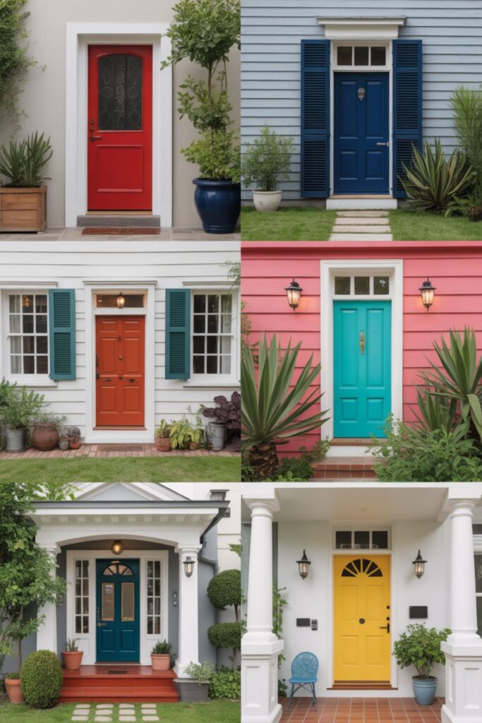
Red doors create classic focal points symbolizing welcome across cultures. Traditional brick reds suit colonial homes, while modern tomato reds make contemporary statements. SW Real Red, BM Heritage Red, or deeper wines like SW Rookwood Dark Red provide options across intensity levels. Red doors coordinate beautifully with neutral gray, white, or taupe body colors without clashing their universal appeal explains their enduring popularity in home color schemes.
Black accents deliver sophisticated drama through matte or gloss finishes. Black front doors against white, gray, or taupe bodies create striking contrast defining entries powerfully. Black shutters add architectural weight without home color ideas outdoors commitment; they coordinate with any body color or accent choice. SW Tricorn Black offers true matte black avoiding blue or brown undertones that muddy this critical neutral. Black’s versatility and impact make it the safest bold choice for risk-averse homeowners wanting personality.
Teal and turquoise provide unexpected freshness particularly stunning on coastal or contemporary homes. These blue-greens feel simultaneously bold and neutral coordinating with most body colors. SW Reflecting Pool, BM Aegean Teal, or brighter options like BM Peacock Blue create memorable entries without overwhelming. Teal’s connection to water and nature makes it inherently welcoming an excellent choice for homes lacking immediate curb appeal through architecture or landscaping alone.
How Climate and Geography Affect Color Selection
Hot climates demand light-reflective colors, reducing cooling costs and preventing paint failure. Light grays, whites, creams, and soft pastels reflect solar radiation maintaining cooler surface temperatures. Dark colors absorb heat creating uncomfortable wall temperatures damaging siding and dramatically increasing air conditioning demands. In desert or tropical regions, prioritize reflection over personal color preferences; your energy bills and siding longevity depend on this critical consideration.
Cold northern climates handle darker colors better through reduced UV intensity and snow reflection benefits. Deep grays, navies, and even blacks create dramatic curb appeal without the heat absorption concerns plaguing southern properties. Dark exteriors also melt snow faster through solar gain extending roof and siding life by reducing freeze-thaw cycles. However, dark colors show salt stains and road grime intensely requiring more frequent cleaning maintenance.
Coastal environments need fade-resistant formulas and appropriate color schemes reflecting regional character. Salt air and intense UV rapidly fade standard paints invest in premium 100% acrylic formulas with UV inhibitors. Traditional coastal palettes feature whites, soft blues, grays, and sandy neutrals connecting homes to beach environments naturally. Bold tropical colors suit Caribbean or Mediterranean climates where architectural traditions support vibrant palettes, but these same home color ideas outdoors feel out of place in New England coastal settings.
Creating Monochromatic Schemes With Depth
Monochromatic palettes using varied values of single colors create sophisticated cohesion through subtle variation. Choose light gray siding with medium gray trim and charcoal accents, or cream body with darker tan trim and bronze door. This approach ensures perfect coordination while providing depth preventing flat boring appearances. Monochromatic schemes suit modern architectural styles beautifully but work equally well in traditional contexts when executed thoughtfully.
Texture variations add visual interest to monochromatic schemes preventing monotony. Different siding materials, varied trim profiles, and contrasting finishes (matte siding with satin trim) create dimension without color changes. This subtle approach feels intentionally restrained rather than limited the mark of sophisticated design confidence that translates beautifully in high-end curb appeal.
Accent elements break monochromatic schemes strategically preventing blandness. Insert natural wood tones, aged metal finishes, or single bold color on doors within otherwise neutral schemes. These measured accents provide personality without abandoning monochromatic discipline they feel curated rather than indecisive achieving designer polish that pure monotone or rainbow schemes can’t match.
Coordinating Exterior Colors With Roofing and Stone
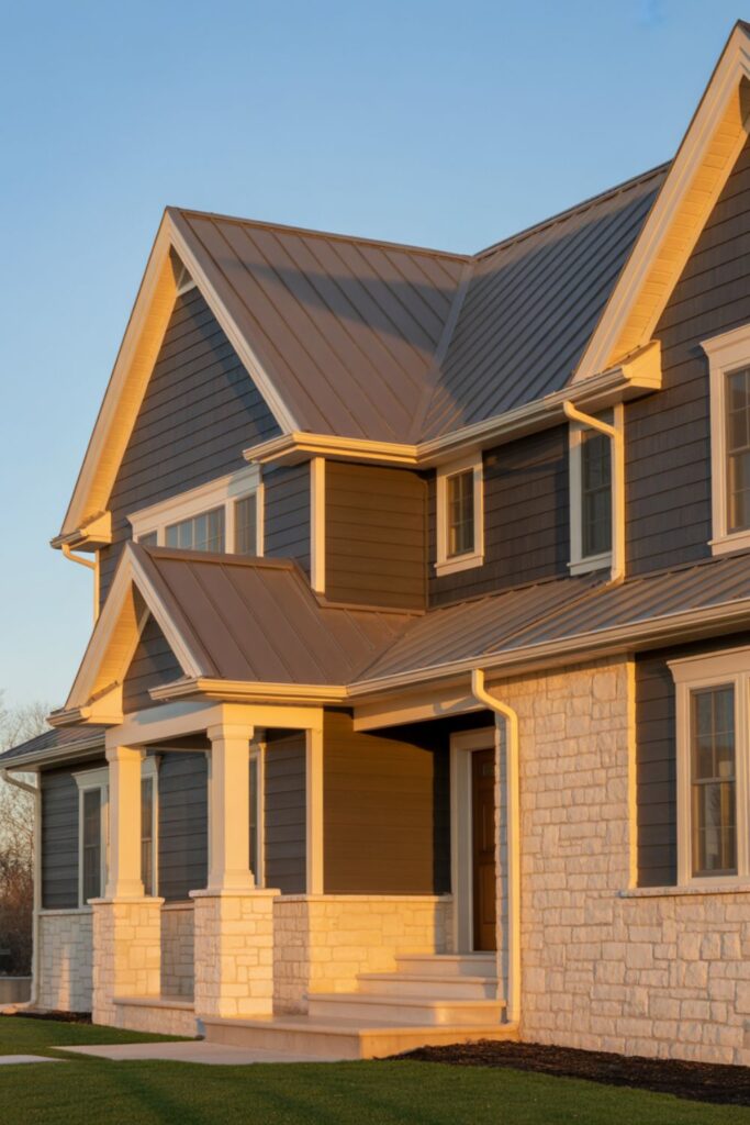
Roofing colors limit exterior palette options requiring careful coordination. Gray roofs pair beautifully with cool grays, blues, or whites but fight warm beiges and browns. Brown or black roofs coordinate with both warm and cool palettes offering maximum flexibility. Terracotta or red roofs demand warm neutral tans, creams, or earth tones avoiding cool grays that clash. Always select roofing first when possible since changing paint costs less than re-roofing this sequence prevents expensive mistakes.
Natural stone or brick elements anchor color schemes through permanent material that can’t change. Pull body colors from stone undertones ensuring harmonious relationships if your stone contains warm browns and rusts, choose warm paint palettes. Cool-toned stone with grays and charcoals demands cool paint coordination. Use trim colors bridging gaps between stone and siding when direct coordination proves impossible; cream trim can mediate between warm stone and cool gray siding successfully.
Landscaping considerations affect home color ideas outdoors success through plant colors, seasonal changes, and hardships. Homes surrounded by lush greenery handle bolder colors that greenery softens, while sparse landscapes need subdued palettes avoiding harsh contrast against bare surroundings. Consider mature tree bark colors, perennial flower hues, and hardscape tones when selecting exterior paints; these permanent or recurring elements affect how colors appear throughout seasons.
Two-Tone and Multi-Color Exterior Schemes
Two-tone designs create architectural interest through strategic color division. Paint siding one color with different color on gables, dormers, or lower foundations defining these elements distinctly. This approach suits homes lacking interesting architecture color and creates visual breaks mimicking architectural detail. Ensure proper value contrast light main body with darker accents or vice versa avoiding mid-tone combinations that muddle rather than define.
Horizontal color divisions work beautifully on homes with distinct stories or foundation changes. Darker lower levels ground homes visually while lighter uppers prevent top-heaviness. This technique particularly suits tall two-story homes that feel overwhelming in single colors. Ensure transitions occur at natural breaks between stories, at window lines, or where materials change avoiding arbitrary divisions that confuse rather than enhance architecture.
Three-color schemes suit ornate Victorian, Queen Anne, or highly detailed homes. Base body color, trim color, and accent color for details create traditional “Painted Lady” effects highlighting architectural complexity. However, limiting three-color approaches to homes with sufficient detail warranting this treatment applying multiple home color ideas outdoors to simple ranch homes looks confused rather than intentional. Match color complexity to architectural complexity ensuring appropriate relationships.
Best White and Off-White Exterior Paint Colors
Pure whites create crisp statements suiting colonial, farmhouse, and coastal architectural styles. SW Pure White, BM Chantilly Lace, or BM Simply White offer clean brightness projecting traditional elegance. However, pure whites show dirt intensely and can appear harsh in strong sunlight. They demand frequent cleaning and suit only homeowners committed to maintenance sustaining pristine appearance. Pure whites also amplify minor siding imperfections through harsh light reflection.
Warm whites with cream undertones provide softer alternatives to stark brightness. BM White Dove, SW Alabaster, or BM Decorator’s White offer subtle warmth avoiding yellow-beige while providing a gentler appearance than pure whites. These versatile neutrals coordinate beautifully with any trim color, roof type, or landscape element while showing less dirt than brighter whites. They suit virtually any architectural style from traditional to contemporary.
Gray-tinted whites create contemporary sophistication through cool undertones. BM Stonington Gray (very light), SW Eider White, or BM Gray Owl provide near-white brightness with gray depth preventing stark harshness. These modern neutrals pair perfectly with black, charcoal, or gray trim creating crisp monochromatic schemes. They particularly suit modern and transitional architecture where true warmth feels inappropriate but stark white seems too traditional.
Dark and Dramatic Exterior Color Choices
All-black exteriors make powerful modern statements through unexpected boldness. Matte black creates contemporary drama while gloss black offers traditional formality. SW Tricorn Black provides true black without muddy undertones perfectly complementing white trim, natural wood accents, or metallic elements. Black suits modern architecture beautifully but works surprisingly well on traditional homes when balanced with substantial white trim preventing overwhelming darkness. Consider climate black absorbs maximum heat unsuitable for hot southern exposures.
Deep navy and charcoal offer dark drama with more versatility than true black. SW Naval, BM Hale Navy, or charcoals like SW Peppercorn provide depth and richness while reading less extreme than black. These sophisticated darks suit traditional and modern architecture equally, coordinate with broader accent color ranges, and feel less stark in large applications. They particularly shine in wooded settings where dark exteriors recede beautifully against natural surroundings.
Forest green creates stately presence connecting homes to natural landscapes. Deep greens like SW Evergreens, BM Essex Green, or SW Pewter Green ground homes organically while providing distinctive home color ideas outdoors rarely seen in neighborhoods. Green suits craftsman, traditional, and mountain architectural styles beautifully. Pair with cream, tan, or natural wood trim avoiding white that creates harsh contrast. Dark greens hide dirt excellently, a practical benefit for heavily wooded properties or rural settings.
How to Test Paint Colors Before Committing
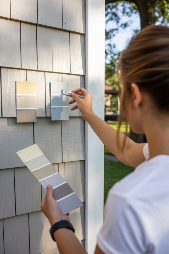
Large sample boards reveal true colors under your property’s specific conditions. Paint 2’x2′ foam boards or cardboard with sample colors taping them to various walls observing through different times of day and weather conditions. Colors appear dramatically different in morning versus afternoon light, sunny versus overcast days, and from various distances. Test minimum three days capturing full range of lighting conditions before making final decisions this small investment prevents expensive regrets.
Directional differences affect color appearance tremendously requiring testing on multiple exposures. North-facing walls receive cool consistent light reading darker and cooler than other exposures. South-facing walls get warm intense light making colors appear lighter and more vibrant. East and west walls experience dramatic shifts from morning to evening. Test samples on each exposure your home features the same color looks completely different on north versus south walls demanding this thorough evaluation.
Neighbor proximity and surrounding colors affect your choices through color relationships. Your desired gray may photograph beautifully but appear dingy next to your neighbor’s bright white or garish beside their cream. Observe existing colors in your immediate neighborhood noting which harmonize and which clash. While you shouldn’t copy neighbors exactly, acknowledging context prevents choosing colors fighting rather than complementing surroundings; this environmental awareness distinguishes thoughtful choices from tone-deaf selections.
Color Ideas for Specific Home Elements
Trim colors define architectural details or disappear subtly depending on contrast levels. High contrast white trim on dark siding emphasizes every molding and window frame creating traditional formality. Monochromatic trim in slightly lighter or darker values creates contemporary subtlety. Choosing approaches matching architectural style and personal preferences neither is universally correct. Traditional homes typically benefit from contrast while modern designs favor subtlety.
Shutter colors coordinate with doors, trim, or stand independently as third accent colors. Matching shutters to doors creates cohesion, matching to trim provides subtle coordination, while contrasting shutters add additional personality. Black shutters coordinate universally with any body or trim color, the safest choice offering architectural definition without color risk. Colored shutters should pull hues from stone, brick, or roofing ensuring coordination beyond arbitrary selections.
Garage door colors often default to body home color ideas outdoors for subtlety or white for contrast. However, treating garage doors as accent elements creates opportunities for personality. Paint garage doors the same color as your front door creating cohesive repetition throughout your facade, or choose complementary colors adding visual interest. Dark garage doors on light homes create contemporary sophistication, while wood-toned doors add natural warmth regardless of body color.
Budget-Friendly Ways to Update Exterior Colors
Front door replacement delivers maximum impact for $200-800 depending on DIY or professional installation. A new door in bold color transforms curb appeal instantly without whole-house painting investments. Choose fiberglass or steel doors with factory color finishes lasting decades without repainting; this low-maintenance upgrade provides long-term value beyond initial installation.
Strategic accent painting refreshes tired exteriors affordably. Repaint just trim, shutters, and doors in updated colors while leaving body color unchanged this targeted approach costs $500-1,500 delivering a significant improvement fraction of whole-house expenses. Choose fresh trim colors updating dated combinations without full exterior paint projects. This phased approach also allows testing new color schemes before committing to complete repaints.
Pressure washing and repair often revitalizes existing colors dramatically. Years of dirt, mildew, and grime make perfectly good paint appear faded and neglected. Professional pressure washing costs $200-500 revealing true color condition. Follow with minor repairs addressing damaged areas, and existing paint may deliver several more years before requiring replacement; this maintenance approach maximizes existing investments before spending on new paint.
Read More About: 27+ Backyard Patio Flooring Ideas for Stunning Outdoor Spaces
HOA and Municipal Color Restrictions
HOA guidelines often limit color choices requiring approval before painting. Review architectural standards documenting approved color palettes, prohibited colors, and approval processes. Submit proposals with large samples showing exact colors in context HOA boards respond better to visual presentations than verbal descriptions. Build relationships with architectural committee members discussing plans informally before formal submissions smoothing approval processes.
Historic district regulations preserve neighborhood character through strict color controls. These regulations may specify historically appropriate palettes or require specific approval processes. Research requirements early, avoiding wasted time pursuing inappropriate colors. However, regulations often allow more flexibility than assumed many historic districts permit contemporary colors when justified appropriately. Consult preservation officers early obtaining guidance streamlining approval processes.
Compromise strategies achieve personality within restrictions. When limited to conservative palettes, maximize impact through bold door colors, creative trim combinations, or distinctive landscaping that guidelines don’t restrict. Focus creative energy on unrestricted elements achieving individuality without violating rules. This strategic approach respects community standards while expressing personal style through permitted avenues.
Seasonal Considerations for Exterior Painting
Optimal painting seasons vary by climate but generally favor mild dry weather. Spring and fall offer ideal conditions in most regions: moderate temperatures (50-85°F), low humidity, and stable weather patterns. Summer heat causes rapid drying creating application problems, while winter cold prevents proper curing. However, modern paints expand seasonal windows and premium formulas apply successfully in broader temperature ranges extending painting seasons regionally.
Weather pattern timing affects success tremendously requiring forecast awareness. Avoid painting before predicted rain. New paint needs 24-48 hours drying before moisture exposure. Wind creates dust adhesion problems and makes application difficult. Plan projects during stable high-pressure systems bringing consistent mild weather. This patience prevents failures from preventable weather damage requiring expensive correction painting.
Prep work seasons don’t always align with painting seasons. Pressure washing and scraping proceed in broader weather windows than painting. Complete prep work during less-than-ideal painting conditions, then execute actual painting during perfect weather windows. This strategic scheduling maximizes good-weather efficiency while using marginal weather productively for compatible tasks.
Frequently Asked Questions
What are the most popular exterior paint colors right now?
Current exterior paint trends favor sophisticated neutrals, warm and cool grays, greiges, and soft whites dominate. SW Repose Gray, BM Revere Pewter, and true whites like BM Chantilly Lace lead popularity surveys. However, bold accents increase particularly black and navy doors against neutral bodies. These timeless choices ensure broad appeal for resale value while providing enough personality avoiding generic appearances.
How often should I repaint my home’s exterior?
Quality exterior paint lasts 7-10 years on siding, 4-6 years on wood trim, and 5-7 years on masonry depending on climate, exposure, and paint quality. South and west exposures fade faster than north and east faces. Premium 100% acrylic paints with UV inhibitors extend lifespans significantly justifying higher costs through delayed repainting. Regular cleaning and minor touch-ups extend intervals further maintenance protects paint investments substantially.
Should I match my neighbors’ color schemes?
You shouldn’t copy neighbors exactly; this creates confusion and eliminates individuality. However, acknowledge context choosing colors harmonizing with immediate surroundings. If your street features predominantly warm neutrals, stark cool grays may feel jarring. Complement rather than copy, and avoid clashing your home should feel like part of the neighborhood while maintaining distinct identity. This balanced approach respects community context while expressing personal style appropriately.
Conclusion
Strategic home color ideas outdoors transform ordinary houses into distinctive properties that command attention, boost resale value, and reflect your personality while respecting architectural style and neighborhood context. Whether you’re refreshing faded paint, correcting dated color choices, or building new construction, thoughtful exterior color selection delivers impact far beyond mere aesthetics through psychological appeal, energy efficiency, and structural protection. The most successful outdoor color schemes balance personal preferences with practical considerations including climate demands, architectural style appropriateness, coordination with permanent materials, and resale value implications ensuring beautiful results that serve you well for years.
Start with thorough testing using large samples on multiple exposures through varied conditions this investment prevents expensive regrets from hasty decisions. Consider your home’s fixed elements including roofing, stone, and landscaping choosing colors that coordinate rather than fight these permanent features. Your ideal exterior palette enhances architecture, suits your climate, respects neighborhood context, and ultimately makes you smile every time you come home. Take action today testing even one color from this guide, and you’ll quickly understand why strategic exterior color selection ranks among the most impactful and satisfying home improvements delivering immediate visual transformation and lasting value returns.


